Options/Features
| With data explorer you can: |
|---|
The Metrics API v1 allows you to create new kinds of network components and register/send custom metrics for these devices |
Setup and Configuration
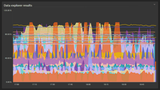
Create a chart:
- Select Explore data from navigation menu
- Select a metric (e.g. “CPU usage %”)
- Choose the Aggregation (e.g. Average, Minimum, Maximum)
- Choose the Visualization type and color scheme on the right-hand side of the page in the Settings tab
- Select Run query
- Select Add metric to add another, and then repeat the previous step
- You may need to adjust the timeframe in the upper-right corner
- Settings can be adjusted at any time on the right-hand side of the page
- When finished, select Pin to dashboard to save it to a dashboard
- If you want to export the chart, use the three buttons (…) next to Pin to dashboard and select the format
- Use the Settings panel to configure chart settings (chart is updated with each change)
Components of a metric query:
| Metric Name |
Select metric name in Filter metrics by… box Can be a built-in metric or metric ingested from Prometheus, Telegraf, etc. through metrics API |
|---|---|
| Aggregation |
AVG, MAX, MIN, SUM, COUNT, or MEDIAN Specifies how the results of the query are aggregated over time and the reported dimensions of the metric Query provides statistically most accurate results for a given query (depends on nature of metric) |
| Grouping | Query groups all dimensions using the metric’s default aggregation |
| Scope |
Determined by any Filter set By default, scope is (include all) Can filter query by selecting an option in the Filter box |
Create a custom event:
You can also create a custom event for alerting, that will send out problem alerts based on your configured settings. For information on how to do this,
- Go to Problem Detection and Analysis and scroll to Metric Breach Configuration
Usage
Limitations
10 metrics maximum per chart
Up to 100 series per metric
Use the chart in data explorer:
- Chart elements are active
- To see details in tooltips, hover over chart elements
- To drill down from a problematic (red) element, select it
- To hide or show a chart element, select the corresponding label in the chart legend
Pin the chart to a dashboard:
- Select Pin to dashboard
- To return to Data explorer with the chart open for viewing and editing, open the menu in the upper-right corner of the tile and select View details. Now two buttons are displayed in the upper-right corner of Data explorer:
- Save changes to dashboard saves the chart to the same tile and dashboard you used to open the Data explorer
- Pin to dashboard saves the chart as a tile on a different dashboard
- For further information on Dashboards, see Dashboarding